Bike Share Mobile App
⬥ HEURISTIC EVALUATION & UI REDESIGN ⬥
A Heuristic Evaluation and User Interface Redesign for Santander Cycle's bike share mobile application.
Duration
Timeline
Role
Platform
Tools
2 weeks
May 2023
Mobile
Figma, Airtable
INTRODUCTION
⬥ the project ⬥
Who is the client?
Santander Cycles is a bike share program in London, UK that was previously known as “Boris Bikes”. They offer monthly and annual memberships targeting London commuters as well as single rides for tourists and/or infrequent riders.
What are their goals?
Santander Cycles aims to offer a fun, healthy and sustainable way to get around London through its bike share program. To support this goal, they developed a mobile application for Android and iOS to help users rent bicycles easily.
The Santander Cycles app’s primary objective is to help users skip the terminal and get on their bike more quickly.
What is their value proposition?
The app achieves this goal through 5 key features:
Send release codes to users’ phones
Show live cycle and docking space availability
Provide recent activity
Plan routes and search for stations
Favorite docking stations
What is the problem?
Though it is colloquially known in London that the Santander Cycles mobile app is much improved from its predecessor’s app, there are still many usability issues that prevent users from fully leveraging the solution.
There are many usability issues that prevent users from fully leveraging the solution
How do I tackle this brief?
For this project, I was on a 2 person team with another UX / UI Designer (Oscar Shields). I suggested we split our work into four steps:
Prepare
Understand how users experience and feel about the app today
Define
Identify the most important user task to evaluate and redesign
Evaluate
Evaluate the existing app based on the Nielsen Norman Group’s 10 Usability Heuristics
Redesign
Redesign the user interface, taking into consideration findings and opportunities for UI improvement
PREPARE
⬥ secondary research ⬥
What do users think?
To better understand how users experience the mobile app and where opportunities may lie for improvement, I combed through user reviews in Apple’s App Store, Google Play, and TripAdvisor. Here’s what we found (as of May 2023):
1
Android App Needs TLC
"The problem with this app is it's reliability on Android."
The Android App received a 1.7 out of 5 star rating from 4.41K user reviews and received overwhelmingly negative feedback, with numerous users expressing frustration and disappointment in its functionality, user experience, and reliability. In comparison, the iOS app received a 3.9 out of 5 star rating with 9K reviews.
2
User Interface has Usability & Accessibility Issues
"Hard to read some text due to background colours. Straightforward tasks like updating payment details are so difficult I just give up"
Users complained about the app's confusing and unresponsive user interface, making it difficult to perform basic tasks like updating payment details.
3
Visibility of Bike and Space Availability is Critical
"Not reliable in terms of showing the actual quantity of bikes available at the chosen dock station."
Many users reported issues with getting accurate and up-to-date information about the availability of bikes and space at docking stations.
4
Payment is the Biggest Barrier
"Everything stops when you have to send the payment card details"
Users, especially users with foreign cards, reported the inability to pay for a rental.
5
Error Messages are Vague & Unhelpful
"Keeps throwing the following error : Object reference not set to an instance of an object at line 68 of GenerateLCHSSubscriptionPicker."
Users shared they received error messages when trying to execute a task but were unfamiliar with what they meant.
DEFINE
⬥ Scope of work ⬥
What do we focus on?
We knew there were massive usability problems but we couldn’t fix everything in the timeframe provided for this project. We laid out the key functions of the app and challenged each other to question each function in relation to the user’s goals:
What is the primary goal of the user?
Is it to figure out how to get from point A to point B (plan a journey)? OR
Do they perhaps already know their destination and simply need to jump on a bike to get there?
How could a user even use the app if they can’t create an account?
Where are they most likely to give up?
It seems payment was a big issue from the reviews.
What happens if they don’t know whether their ride has ended? Or if their 30 minutes is up?
After considering these and many other questions, we honed in on “hire a bike” as a cyclist’s primary goal with the assumption that most people are using Santander Cycles as an alternate mode of transportation. Like hailing a taxi, taking a bus, or riding the train, they likely know where they’re going and simply need to know where there’s a dock at the beginning and end of their journey.
EVALUATE & REDESIGN
⬥ HEURISTIC EVALUATION & REDESIGN ⬥
Where are the issues?
What are the recommendations?
With our scope defined, we moved forward with the Heuristic Evaluation. We studied each screen in the bike hire task flow and identified violations to the 10 Usability Heuristics for User Interface Design. We organized our findings by screen (as opposed to violation), making sure to include the issue, severity level, and recommendations.
1
Home Screen
Heuristic Violation(s):
#1 Visibility of System Status
#7 Flexibility and Efficiency of Use
Severity:
Minor
Current Design
Re-Design
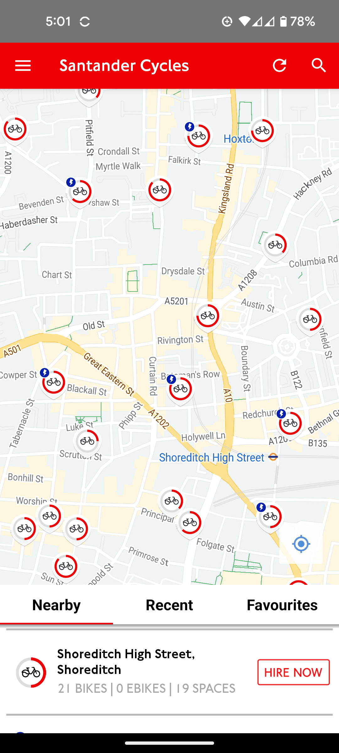
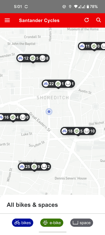
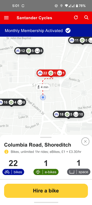
(#1) Docks provide limited information on bike/space availability
(#1) No indication of user's location on map.
(#7) No ability to filter docks by bikes/spaces
Dock indicators provide count of bikes/spaces
User’s location added
Ability to filter docks by bikes/spaces
2
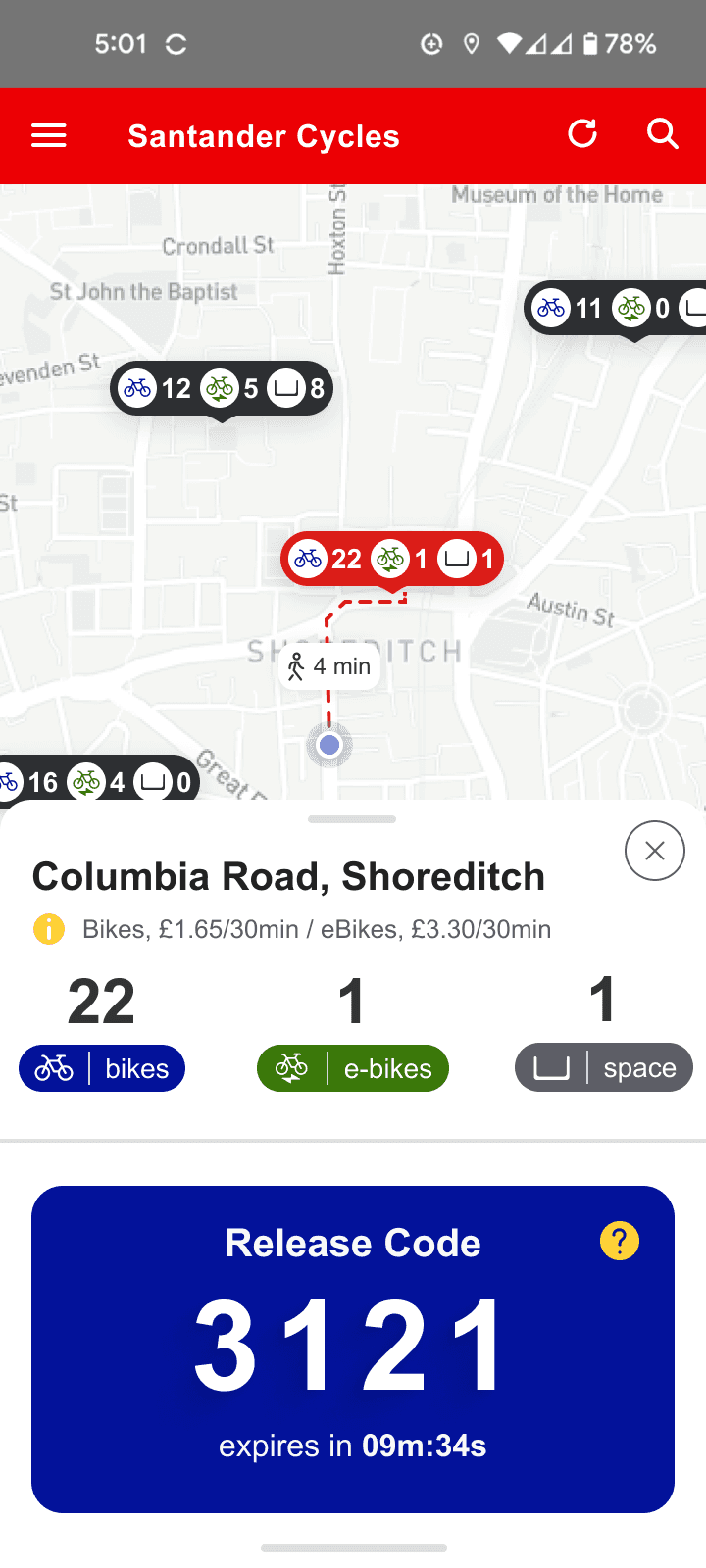
Dock Modal
Heuristic Violation(s):
#6 Recognition Rather Than Recall
#4 Consistency and Standards
#3 User Control & Freedom
Severity:
Minor
Current Design
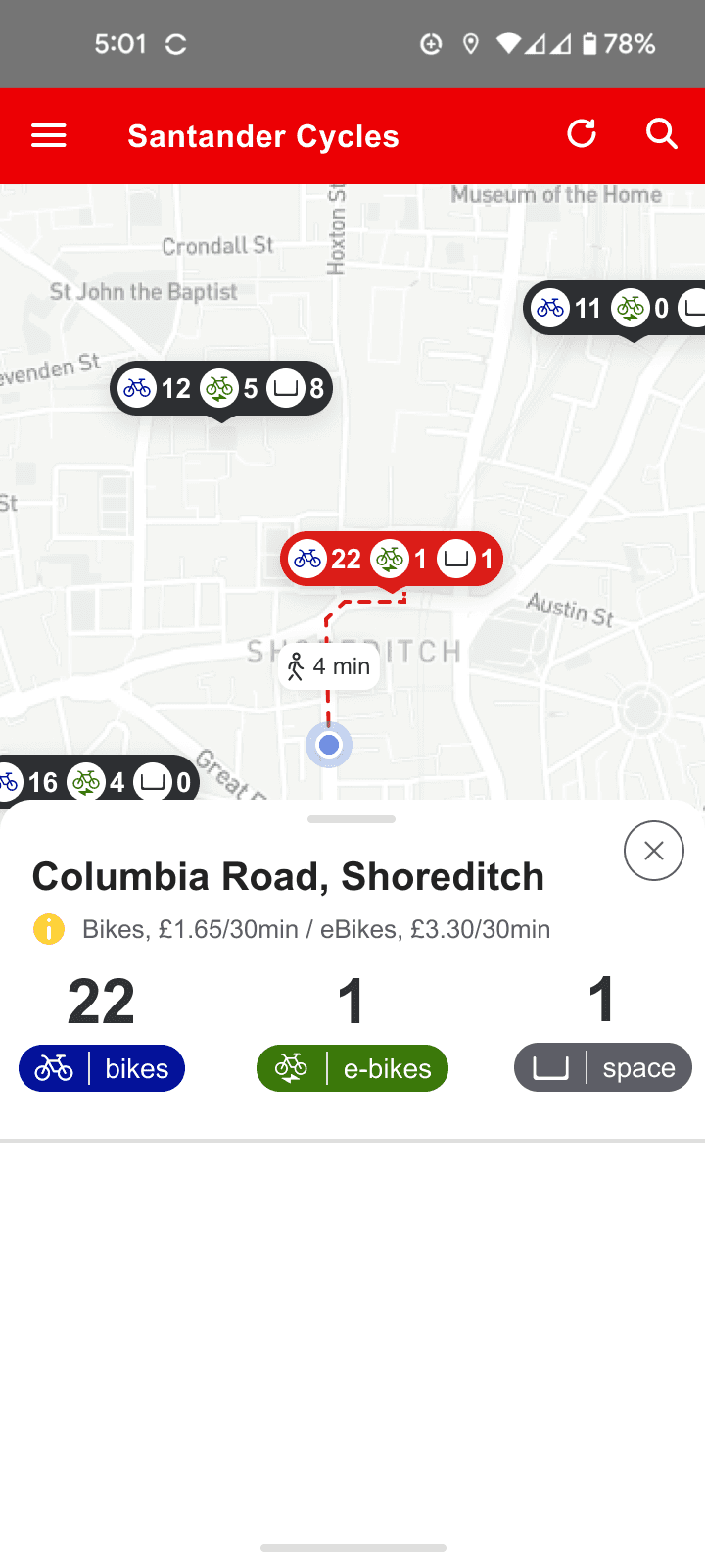
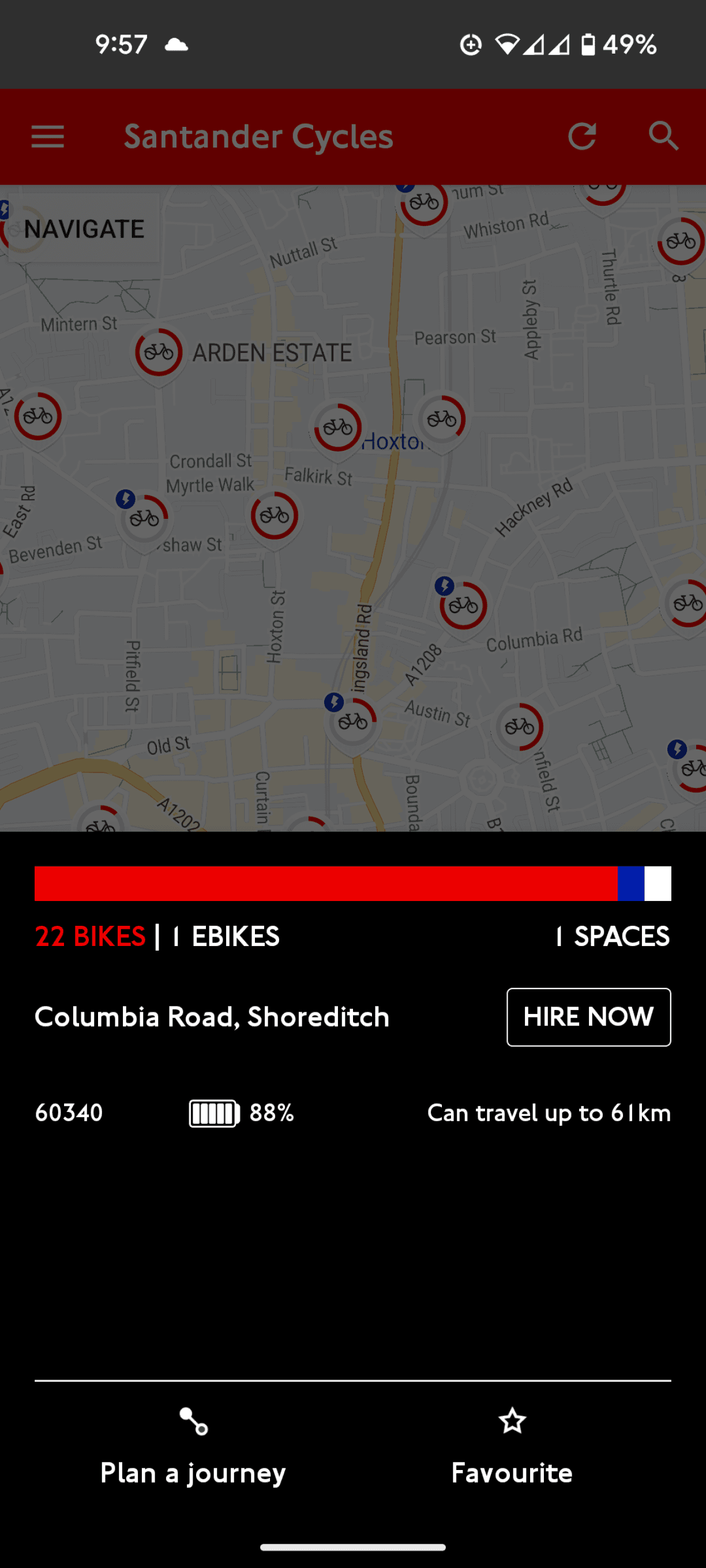
(#6) Selected dock is not shown on the map
(#3) No clear way to un-select dock
(#4) e-Bike availability represented by blue AND white
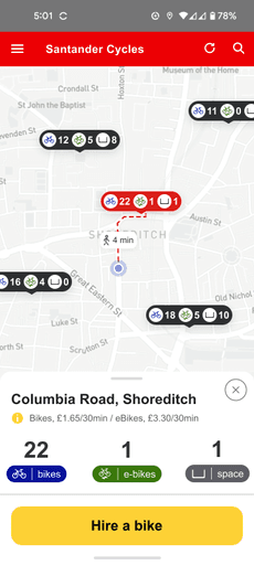
Re-Design (MINIMIZED)
Selected dock prominently displayed on map in relation to user's location; enabled by minimized dock modal
Colors for bikes, e-bikes, and spaces consistently applied
Close modal icon added
Heuristic Violation(s):
#2 Match between System and the Real World
Severity:
Minor
Current Design
(#2) Imperial system used for distance in the UK, not metric
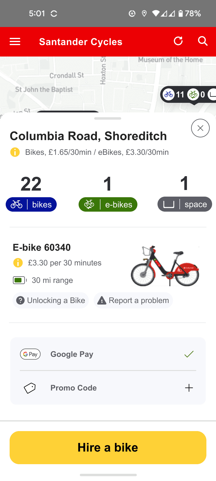
Re-Design (EXPANDED)
Clarify ID # is specific to the e-bike
Use miles to indicate range
(#2) Unlabeled ID #
3
Hire Options Screen
Heuristic Violation(s):
#8 Aesthetic and Minimalist Design
#7 Flexibility and Efficiency of Use
Severity:
Minor
Current Design
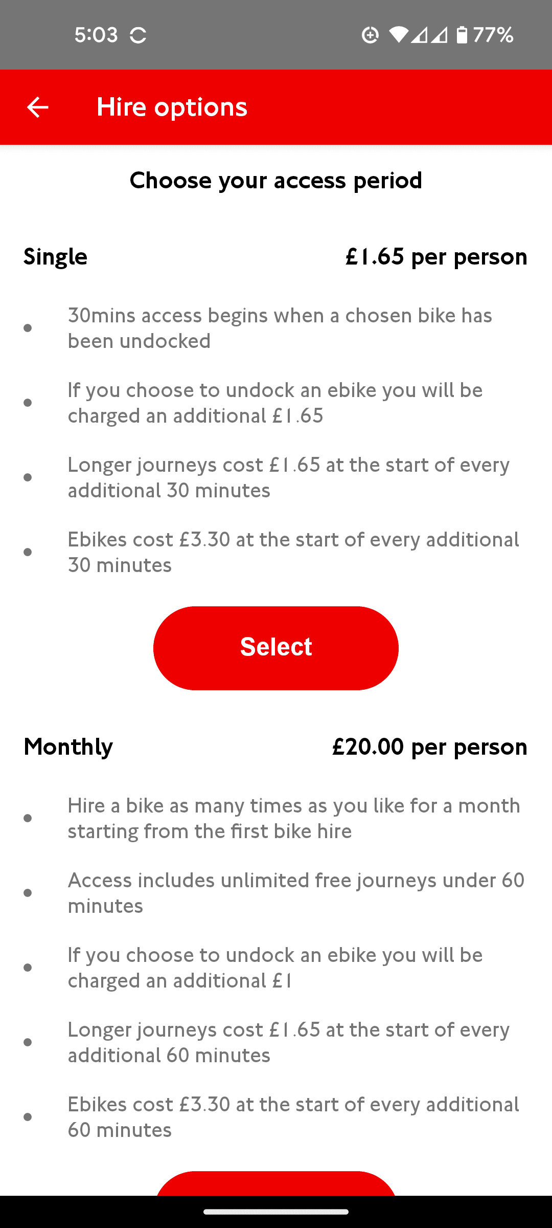
(#8) Overwhelming amount of information on the hire options screen
Re-Design (MINIMIZED)
Summarized the single ride hire’s pricing information
(#7) Standard bike hire screen for all users = inefficient experience for subscribers
4
Payment Screen
Heuristic Violation(s):
#4 Consistency and Standards
Severity:
Minor
Current Design
Re-Design
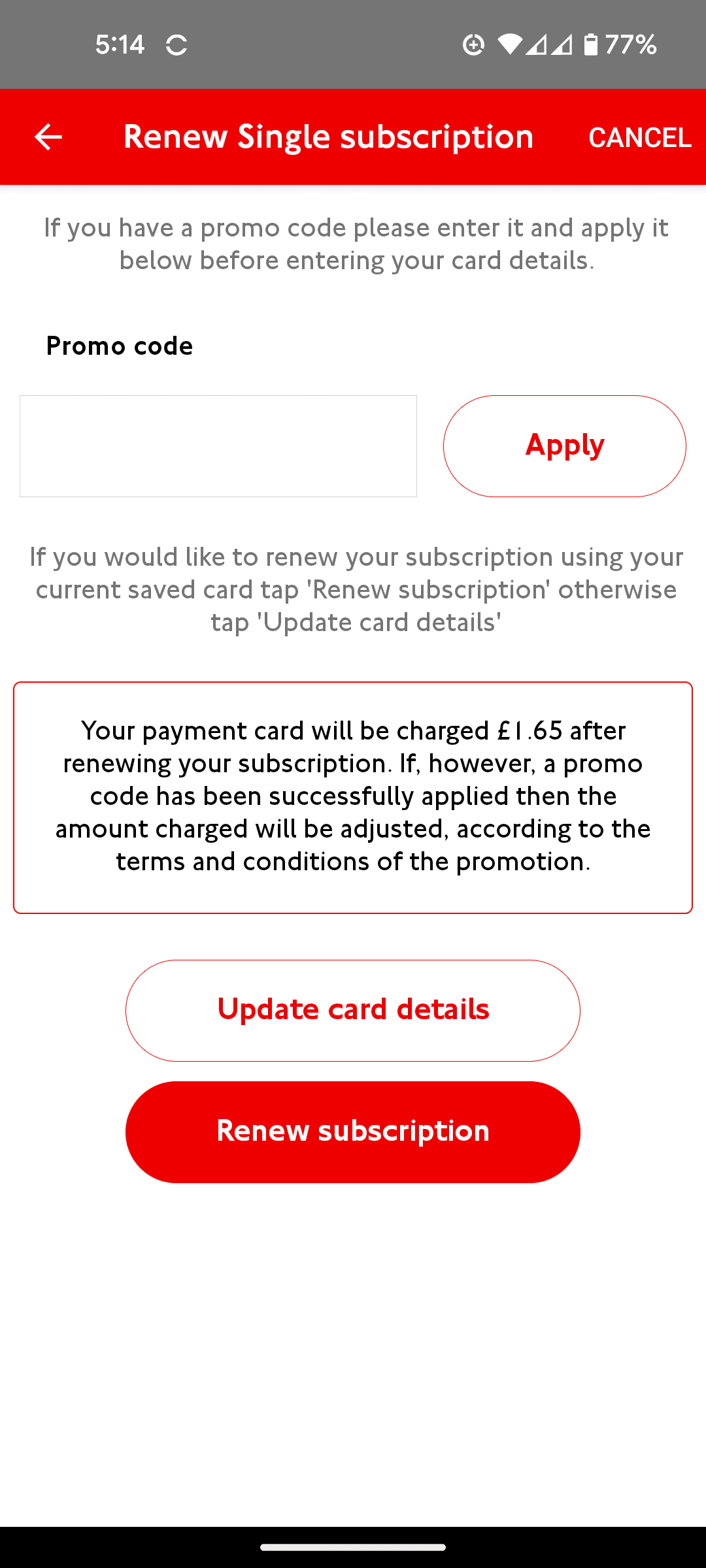
CTA specific to hiring a bike
(#4) Single rides should not be referred to as a subscription
5
Confirm Hire Screen
Heuristic Violation(s):
#7 Flexibility and Efficiency of Use
Severity:
Minor
Current Design
Re-Design
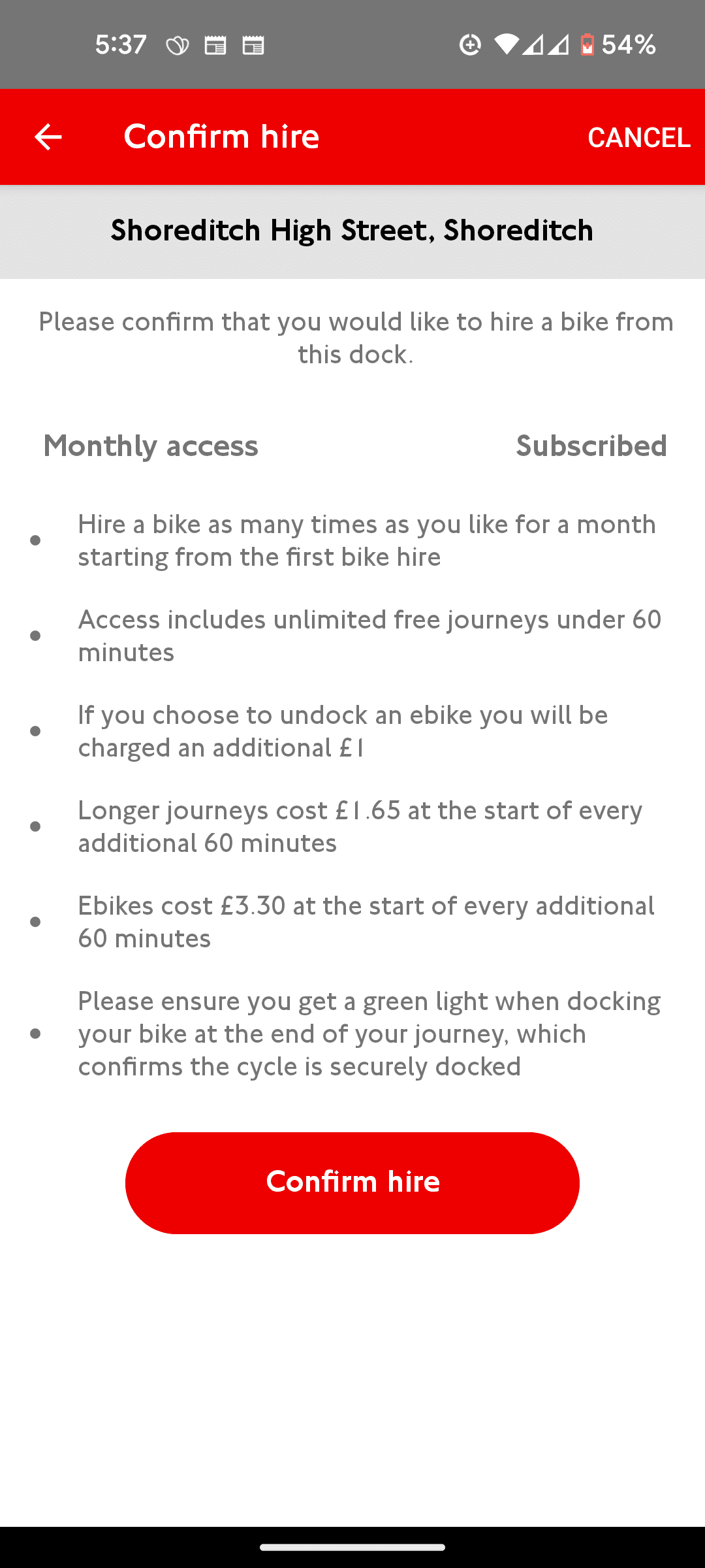
(#7) Unnecessary information on monthly subscription for current subscribers
Visual cue for activated subscription
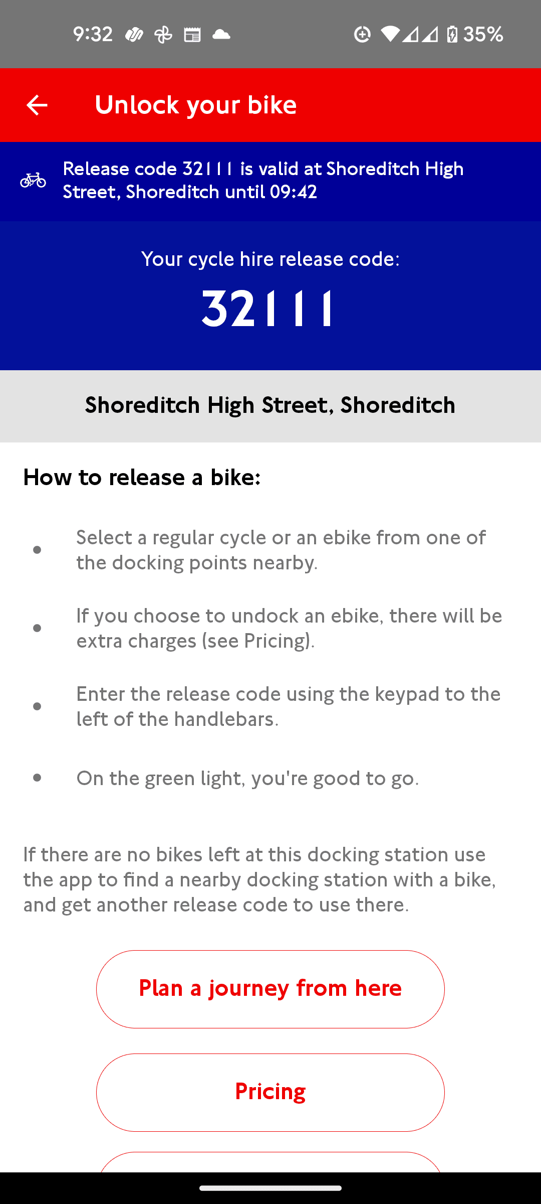
6
Unlock Bike Screen
Heuristic Violation(s):
#8 Aesthetic and Minimalist Design
Severity:
Minor
Current Design
Re-Design (MINIMIZED)
Clarify ID # is specific to the e-bike
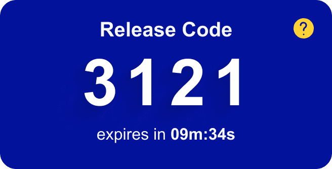
(#8) Release code could be more prominent
Increased prominence of release code
Add'l info available if help icon pressed
SUMMARY
⬥ HEURISTIC violations ⬥
Across the 6 screens evaluated, we determined 7 out of 10 heuristics were violated in the current design of the Santander Cycles' Android mobile app.
#1
Visibility of System Status
#2
Match between System and the Real World
#3
User Control and Freedom
#4
Consistency and standards
#6
Recognition Rather than Recall
#7
Flexibility and Efficiency of Use
#8
Aesthetic and Minimalist design
#1
#7
#6
#4
#3
#8
#7
#4
#7
#8
Home Screen
Dock Modal
Options Screen
Renew Screen
Confirm Screen
Unlock Screen
⬥ recommended solutions ⬥
Oscar and I focused our UI redesign efforts on resolving these violations. We were able to make three key improvements as a result:
User can orient themselves more easily when searching for a dock
Users can easily review pricing earlier in the process
Hiring process is more streamlined
Home Screen
Dock Modal
Dock Modal (Expanded)
Unlock Screen
Along the way, we identified opportunities to improve the overall user flow and experience of the app.
Hiring a Bike: Current State & Usability Issues
Hiring a Bike: Future State with Solutions
⬥ next steps ⬥
Great! What next?
As next steps, we would recommend further evaluating the app's functionality and identifying not only heuristic violations but also user experience issues to resolve.
1
Monthly and annual subscribers
Enhance user experience for subscribers, ensuring the bike hire and payment processes are streamlined
2
Riders planning a journey
Incorporate space availability at the destination dock when planning a journey
Offer correct time estimates for journeys
3
Tourists following a recommended route
Make it easier for tourists to follow a recommended route and identify docks near attractions
4
Ending a ride
Confirmation of completed ride in the app
Ability to extend trip if destination dock is full
Visibility into time left in ride
5
Reviewing recent activity
Current app only shows the last month of activity
Suggest membership for frequent single riders
